


Kaspersky Plus
Güvenlik. Performans. Gizlilik. Hepsi kullanımı kolay tek bir uygulamada.

Kaspersky Small Office Security
Küçük ölçekli işletmenizi kolayca koruyun


Kaspersky Password Manager
Parolalarınız ve belgeleriniz her zaman elinizin altında


Kaspersky Small Office Security
Unkomplizierter Schutz für kleine Unternehmen


Premiumversion
Kaspersky Safe Kids
Behalten Sie Ihre Kinder im Auge, auch wenn Sie nicht in der Nähe sind

Kaspersky VPN Secure Connection
Sicher. Privat. Außergewöhnlich schnell. So sollte Internet sein.

Kaspersky Standard
Mejora la protección con el optimizador del rendimiento del dispositivo

Kaspersky Plus
Seguridad. Rendimiento. Privacidad. Todo en una única aplicación fácil de usar.
Kaspersky Small Office Security
Proteja fácilmente su pequeña empresa
Versión premium
Kaspersky Safe Kids
Supervisa a tus hijos, incluso cuando no estés con ellos

Kaspersky Small Office Security
Protégez votre PME sans effort
Kaspersky Plus
Combina recursos de segurança, desempenho e privacidade em um aplicativo
Kaspersky Small Office Security
Proteja a sua pequena empresa sem esforço

Kaspersky Premium
Proteção completa para seus dispositivos, privacidade online e identidade

Versão Premium
Kaspersky Safe Kids
Fique de olho nas crianças, mesmo quando não estiver por perto
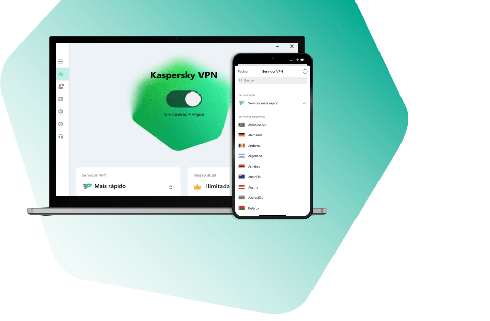
Kaspersky VPN Secure Connection
Segura. Privada. Excepcionalmente rápida. Como a internet deveria ser.
Kaspersky Standard
Protezione avanzata con ottimizzazione delle prestazioni dei dispositivi
Kaspersky Small Office Security
Protezione immediata delle piccole aziende

Versione premium
Kaspersky Safe Kids
Accertati che i tuoi figli siano al sicuro, anche quando non sei con loro


Kaspersky Secure Connection
Простое решение для защиты конфиденциальности и безопасности ценных данных
Recommended Posts